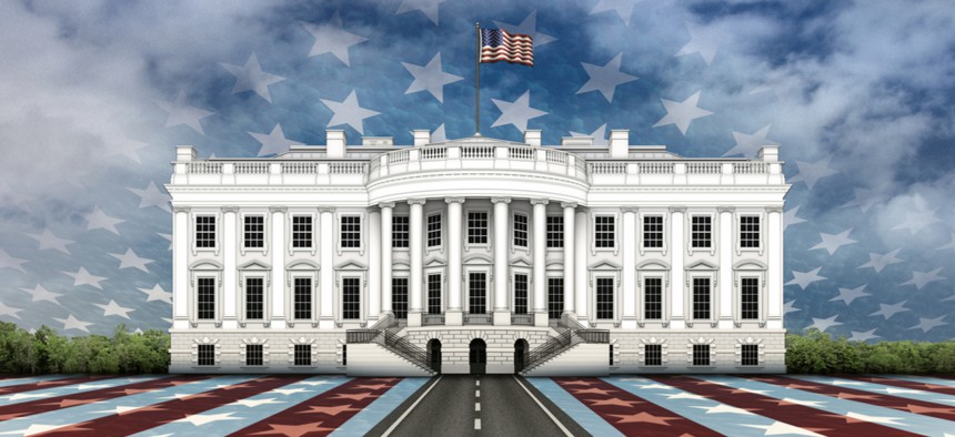
White House Launches Revamped Website

Jim Larkin/Shutterstock.com
The new site is designed to match private sector quality, a senior administration official says.
The White House redesigned its flagship website in an attempt to match the multimedia capabilities of counterparts in the private sector, a senior administration official told reporters Thursday.
The new live site, replete with crisp photos of President Donald Trump and the White House’s Christmas decorations, as well as links to blog posts on the administration’s infrastructure plan, is intended to “deliver the president’s message directly to the American people,” the official said.
The site is designed to include a new search tool allowing users to filter by issue and date, spanning content from Trump’s and previous administrations, the official said. As of now, the site doesn’t appear to return archived results from before 2017.
Some of the White House executive offices, such as the Office of Management and Budget, kept a minimal profile. The Office of Science and Technology Policy's section doesn't have much more than contact and internship information.
The revamped site could save taxpayers $3 million per year in development and maintenance costs, down from more than $6 million per year for the old site, according to the White House.
The White House’s Office of Digital Strategy did the bulk of the redesign. Developers relied heavily on open-source technology and plan to continuously evolve the site instead of conducting periodic massive redesigns, the official said.


Editor’s Note: This article was updated Dec. 15 when the website launched.


