What not to do with your data
Two new books help map out the danger zones of data visualization, and of the datasets themselves.

The federal government has long produced data by the truckload, and the open-data initiatives of the Obama administration have put more of it in the public eye than ever before. And although many agencies have moved beyond spreadsheets and CSV files to offer dashboards, maps and other visualization tools, the vast majority of those presentations are not very good.
Nathan Yau is trying to change that.
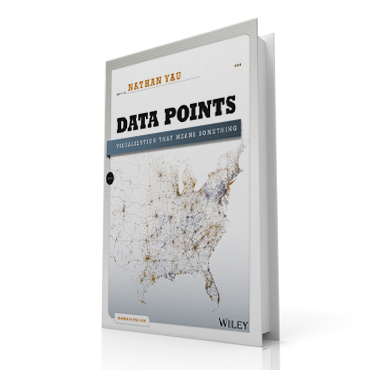
His book, "Data Points: Visualization that Means Something," does not focus on agencies in particular, though federal data is discussed and used in dozens of sample charts and graphs. Whether it is census data or a chart comparing the cost of cable television vs. Netflix and other "cord-cutting" options, the challenge remains the same: how to make a visual presentation clear enough to be easily comprehensible, yet informative enough to tease out real insights. Effective visualization is hard, Yau stressed, and requires a mix of math and design skills that few individuals possess.
"Data Points" is not a technical how-to guide — though Yau has written that, too, with his 2011 book, "Visualize This." His goal this time is to walk would-be data visualizers through the process of design and analysis, from the ground rules of statistics and visual aesthetics to proven best practices for storytelling and common errors to avoid.
Want to know whether to use a pie chart or a bar chart for a particular dataset, and what signals a map's color palette sends to the audience? "Data Points" has the answers. Curious about how to explore and display the correlation between two variables? Yau plots education data from all 50 states 18 ways and shows how different visuals can uncover very different patterns in a single dataset.
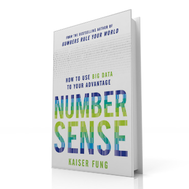
With a mix of hard rules, best-practice examples, and data-visualization history that dates back to William Playfair and Florence Nightingale, Yau seeks to impart a mindset as much as a skill set. "The mark of a good graph is not only how fast you can read it," he wrote, quoting statistician William Cleveland, "but also what is shows. Does it enable you to see what you could not see before?" Kaiser Fung's new book, meanwhile, dispenses with the aesthetic visual storytelling questions entirely, instead drilling into the dangers of datasets themselves. In "Numbersense: Using Big Data to Your Advantage," Fung warns that "people in industry who wax on about Big Data take it for granted that more data begets more good.... [But] when more people are performing more analyses more quickly, there are more theories, more points of view, more complexity, more conflicts and more confusion. There is less clarity, less consensus and less confidence."
In Fung's view, the core problem is not that the creators of a dataset are trying to mislead — though there are plenty of examples of that as well, many of which he has documented over the years on his "Junk Charts" blog. Rather, he said, most consumers of data are essentially innumerate and do not understand basic statistics or the countless judgment calls that go into developing a dataset.

To fill those knowledge gaps, "Numbersense" presents eight chapter-length case studies. The consumer price index and monthly unemployment reports are placed under Fung's microscope, as are law school rankings, Groupon's economics, fantasy football stats and multiple firms' marketing efforts. Even the dieter's dreaded body mass index gets deconstructed.
So although Fung praises the Bureau of Labor Statistics for the "impressive accuracy" of its payroll survey, he shows how the definition of unemployment is at least as important as the tallying process. When does an out-of-work individual slip out of the workforce? Do you have any idea what the "seasonal adjustment" entails? And what happens when an employer simply skips that month's survey? As Fung notes, "Statisticians have a cautionary saying: Absence of evidence is not evidence of absence."
At its core, Fung's warning boils down to Mark Twain's frequent dictum that there are three kinds of lies: lies, damned lies and statistics. Yet a basic understanding of data and some healthy skepticism can go a long way, Fung promises. Know where the numbers come from and what assumptions were made in crunching them, and you'll avoid the lion's share of confusion and mischief. As Fung succinctly put it, "The key isn't how much data is analyzed, but how."


