FCC Website Gets a Refresh

FCC
A prototype of the site went live after months of research and focus groups.
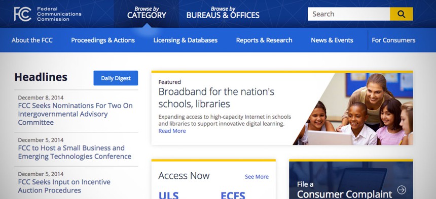
After devoting more than eight months to research and design work, a Federal Communications Commission team has released an interactive prototype of its refurbished website.
Unveiled Monday, the prototype features cleanly laid out navigation bars, accessible agency resources and a separate section meant specifically for general consumers, according to an FCC blog post.
“The focus of our research was to identify and understand what different FCC.gov visitors want from our website and how to optimize the way they search, use and interact with the website,” the blog post stated.
A team from the agency analyzed Web content and analytics to determine which pages and terms were frequented most, according to the FCC statement.
The final research step involved the team interviewing outside stakeholders about their experience using the site and any points of concern they had. The collaborative effort resulted in "a fully responsive and 508-compliant prototype of the FCC’s new website design,” according to the blog post.
The site can be used on a computer, tablet or mobile device.
FCC.gov receives visits from both consumers and practitioners. While practitioners tend to visit the site on a daily basis looking for “cut and dry” information, consumers tend to visit much less frequently and often want broader-based information, according to the agency post.
The website is still a work in progress.
Over the next few months, the team plans to add a more robust search application to allow users to explore information from both FCC.gov and its Electronic Document Management System.
It also plans to follow in the digital steps of many other federal websites, adding an extra layer of security by transitioning to Hyper Text Transfer Protocol Secure.
The next final site is unexpected to be unveiled at the end of September, according to an agency statement.
NEXT STORY: CDC and DARPA both go deep


