Why Some Apps Use Fake Progress Bars

Supphachai Salaeman/Shutterstock.com
Designers use “benevolent deception” to trick users into trusting the system.
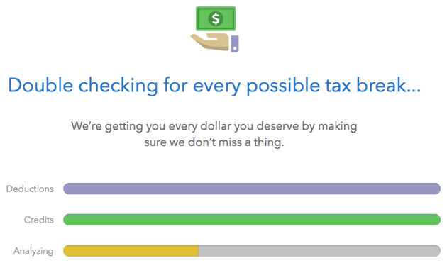
In a fit of productivity, I did my taxes early this year. They were a bit more complex than usual, so I set aside some time to click through TurboTax and make sure I got everything right. Throughout the process, the online tax-preparation program repeatedly reassured me it had helped me identify every possible tax deduction I qualify for, and made sure I didn’t make any mistakes. Attractively animated progress bars filled up while I waited for TurboTax to double- and triple-check my returns.
But as I watched one particularly slick animation, which showed a virtual tax form lighting up line by line—yellow or green—I wondered if what I was seeing actually reflected the progress of a real task being tackled in the background. Did it really take that long to “look over every detail” of my returns, which is what the page said it was doing? Hadn’t TurboTax been checking my work as we went?
I sat down with my colleague Andrew McGill to figure out what was going on in the background. We combed through the source code powering TurboTax’s website, and soon confirmed my suspicion: The animation was fixed. It didn’t appear to be communicating with the site’s servers at all once it began playing—and every TurboTax user saw the same one, which always took the same amount of time to complete. (The same went for at least one other page that purported to show the progress of TurboTax’s checks for “every possible tax break” with three animated bars.)
But why? Why misrepresent how long it takes to complete a process, and take up unnecessary time doing so?
It’s not because TurboTax delights in messing with its clients. Instead, the site’s artificial wait times are an example of what Eytan Adar, a professor of information and computer science at the University of Michigan, calls “benevolent deception.” In a paper he published in 2013 with a pair of Microsoft researchers, Adar described a wide range of design decisions that trick their users—but end up leaving them better off.
Benevolent deceptions can hide uncertainty (like when Netflix automatically loads default recommendations if it doesn’t have the bandwidth to serve personalized ones), mask system hiccups to smooth out a user’s experience (like when a progress bar grows at a consistent rate, even if the process it’s visualizing is stuttering), or help people get used to a new form of technology (like the artificial static that Skype plays during quiet moments in a conversation to convince users the call hasn’t been dropped).
The word “deception” has a negative connotation, and lying to users is generally frowned upon. But Adar says it’s actually a useful, beneficial tool if deployed correctly—and that designers have been tricking their users for years, even if they preferred not to think of it that way.
Curiously, the case of the TurboTax animations is a departure from most of the deceptive practices Adar studied: Rather than covering up a system slowdown, it’s introducing one. The delay, it turns out, is meant to build customers’ confidence in the product to which they just entrusted all their financial information.
“The process of completing a tax return often has at least some level of stress and anxiety associated with it,” said Rob Castro, a spokesperson for TurboTax’s parent company, Intuit. “To offset these feelings, we use a variety of design elements—content, animation, movement, etc.—to ensure our customers’ peace of mind that their returns are accurate and they are getting all the money they deserve.”

Adar made a similar decision in a game he designed as an experiment nearly two decades ago. The game, which involved two people negotiating on a price on two separate mobile devices, culminated in a complex step: Both participants’ bids were encrypted, transmitted wirelessly and compared, and a software program would show whether a deal could be reached.
Despite its complexity, this step was nearly instantaneous in the game’s first iteration. But the speed confused people.
“Their reaction was, ‘Wow, was that it?’” Adar said. “That was sort of a bummer for us.” He devised a tweak: Instead of happening immediately, the final step launched launched an onscreen animation, which took over the screen with asterisks
The security theater appeared to work. “Their delight seemed to increase—and maybe their confidence as well,” Adar said. (The difference was anecdotal; the researchers never formally tested participants’ reactions.)
Although designers don’t always like to talk about it, the practice of building in artificial waits isn’t uncommon. Last year, Fast Company’s Mark Wilson discovered Facebook uses the same trick on its safety page. He turned up other examples, too: a loan-approval app that builds suspense before delivering results to avoid making customers suspicious, and a site for delivering personalized phone-plan recommendations that slowed down its response time in order to convince users they were actually getting custom results. Examples abound on Twitter, like this progress bar on a Verizon webpage that’s just a timer.
Wilson cited a 2011 paper from a pair of Harvard professors that studied this effect—they named it the “labor illusion”—in detail. They found that websites that made their operations look easy were actually less satisfying to consumers.
“When websites engage in operational transparency by signaling that they are exerting effort, people can actually prefer websites with longer waits to those that return instantaneous results,” they wrote. “Even when those results are identical.”
But not every benevolent deception is designed to make people think the system they’re interacting with is in total control. One trick in particular injected uncertainty into a visual representation of data—and triggered near-heart attacks across the country.
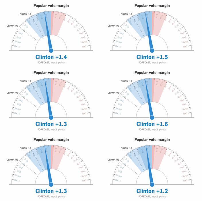
The online election-day dashboard on The New York Times included a set of three dials across the top, displaying the newspaper’s best guess at Hillary Clinton and Donald Trump’s shares of the popular vote, their electoral college votes and their chance at winning the presidency. Throughout the night, the needle on each of the gauges danced and wiggled, starting in what appeared to be deep Clinton territory and ending, well after midnight, squarely on a Trump victory.

The needles were in constant motion—back and forth, back and forth—adding to the anxiety of the moment. A few enterprising readers dug into the page’s source code, found the needles were jiggling randomly and let out their rage on Twitter. More than one person used the word “irresponsible.”
Gregor Aisch, one of the Times designers behind the election dashboard, justified the needle’s quiver on his blog the following week. The needle only wandered within the margin of error of the forecast at any given moment, Aisch explained. The movement was designed to emphasize the live, ever-changing nature of the forecast, while visualizing the uncertainty included in the model’s output. The forecast became more precise as the night wore on, and so the needle jittered less and less.
I asked Aisch whether the blowback to the anxiety-inducing dials made him to reconsider any of his team’s decisions. It didn’t. The visualization accurately depicted what it was meant to, he said, and he’d use a similar tactic if he were designing the dashboard again. The negative response may have really been misdirected anger at the vote tally, he predicted.
“During election night, we were simply the first ones to destroy the hopes of a lot of people,” Aisch said. “Hence, we took the fire.”
The one thing Aisch said he’d do differently is not to display each candidate’s chance of winning as a percentage. To most, he said, an 80 percent chance of a Clinton win seemed like a home run, when it fact, her victory was far from certain.
“Nobody would ever trust contraceptives if their chance of failure was one in five, but we made many people believe that Clinton had a clear advantage,” Aisch said.
When Twitter users pulled away the curtain and Aisch’s deception was revealed, some felt they’d been maliciously tricked. A deception, after all, works best when it’s deceiving people.
I asked Adar if there was a point at which deception crosses from benevolent to malevolent. He set down three ground rules: Designers should prefer nondeceptive solutions to problems, their deceptions should measurably improve the product, and the user—if asked—should prefer the deceptive solution. (Of course, most designers won’t have the chance to ask their users whether they want to be tricked, so they have to make that call on their own.)
But a deception beneficial to a user doesn’t necessarily have to set the designer back. In fact, Adar says, a good deception usually benefits everyone involved: Happier users keep coming back to use—and perhaps pay for—a well-designed service.
Take the TurboTax example. Its design touches may make customers less stressed during tax season, and make them feel better about their finances. They, in turn, will come back and keep paying for the service every year.
But TurboTax has another incentive to keep the process from moving as quickly as possible. Its service is a friendly guide through the thorny jungle of credits, benefits, deductions, and forms that Americans must tromp through every year, and it’s in Intuit’s best interest to make that jungle seem as thorny and inhospitable as possible. The company regularly lobbies to keep the complicated U.S. tax code in place, and opposes proposals that would radically simplify it.
So a few extra seconds of animations that make you feel like TurboTax is slaving away diligently on your returns is sure to make you feel better—but it also keeps you in awe of what Intuit’s software is doing. When, at the end, it asks you to fork over 50 or 100 bucks for the effort, those few seconds might make pulling out your credit card a little easier.
NEXT STORY: GSA watchdog barks at 18F on shadow IT


