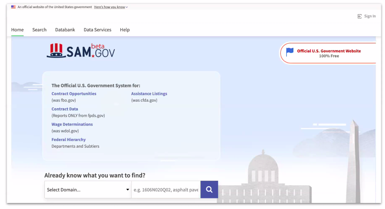
Design Changes Coming Soon to beta.SAM
While most of the changes will be cosmetic, the design update is the result of years of user feedback and adherence to relatively new digital services standards.
Come Monday, the General Services Administration’s central procurement website, beta.SAM.gov, will get a new look, shuffling and tightening the image and feel of the site in response to years of user feedback.
The design update scheduled for April 26 is the first of a two-step process that will end in the merger of beta.SAM and the original SAM.gov—the site that hosts the System for Award Management registration function, required for all organizations contracting with or receiving grants from the federal government. At that time—currently set for May 24—SAM.gov will be retired and beta.SAM will lose the “beta,” become SAM.gov and subsume all of the legacy SAM functionality.
“Since we first launched beta.SAM in August of 2017, a lot has changed since then,” Christy Hermansen, design lead for GSA’s Integrated Award Environment, said Tuesday during a stakeholder forum outlining the upcoming changes. Hermansen cited legislation such as the 21st Century Integrated Digital Experience Act, or IDEA Act, which set baseline requirements for usability of federal websites and access to digital services. “We’ve had to update our look and feel to be in line with those” standards, she added.
Much of the update will be cosmetic—such as rebranding the assistance link from “Learning Center” to “Help”—but are designed to improve the user experience.
Hermansen said IAE received nearly 35,000 comments through the feedback tool on the website, many of which were incorporated into the upcoming update. One of those changes was to move the feedback tool, itself, which was on the side rail but will move to the footer come Monday.
“We’ve tried to make it easier to find information on the site,” she said.
The most notable change will be to the homepage, which will lose the large graphic at the top and move the tools—like Contract Opportunities, formerly FedBizOpps, and the other sites that have been migrated in—higher up, so users will no longer have to scroll down to reach them.

“The homepage has changed significantly,” Hermansen said, the result of “an awful lot of iteration” over the last few years. Feedback came through the tool on the site, as well as through stakeholder forums and user testing.
“This was not a quick switch from one experience to the other,” she said. “This actually matured over quite a long time.”
The search tool widget will be moved down from the top of the homepage, though a search option will be included in the navigation menu at the top.
The update also “tightened” up the search function on the landing pages.
“We’ve done a lot of changes to the look and feel of the search,” Hermansen said, including making the set of filters more compact so that users can see all the options at the same time.
“You’ll see a couple of improvements to some of the individual filters,” she added. “We’re working on tightening up the layout of this, as well.”
But the functionality of most of the tools on the site won’t be changing, Hermansen said.
For instance, when users sign in and go to their main landing page—the workspace—the changes will be minor.
“The header is different, there’s a different footer, but the page itself is actually the same,” Hermansen said. “None of the actual meat of this page is changing.”
That also goes for the Data Bank page, where users can run reports on contracting data—a function formerly housed on the Federal Procurement Data System website, fpds.gov.
Similarly, the menu items are “essentially the same,” but should be more visible with the design update.
GSA is planning two more informational sessions on the beta.SAM/SAM merger, with the next set for May 5.


