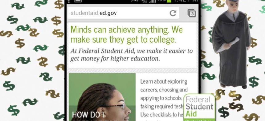
StudentAid.gov provides loan info on the fly

Chanin Knight/Nextgov.com
This mobile site delivers good data, but the graphics are distracting.
This story is part of Nextgov’s Building Better Apps project.
The Education Department’s StudentAid.gov mobile website has a lot of information for current and prospective college students and the developers made a good decision to go with a mobile website rather than a native app, our reviewers said.
The mobile site’s homepage, however, didn’t offer enough information and it was difficult to navigate out of, they said.
Our reviewers gave the site 3.7 out of 5 points.
“This information is likely not frequently used enough on a mobile device for most people to justify the investment in a mobile app,” said Yaron Oren, chief operating officer at iSpeech. “However, making the information accessible on a mobile-optimized website is a smart move for any content provider.”
Pictures of student faces on the homepage also made the app slow to load and didn’t add much to the design, said PracticeQuiz.com founder Ted Chan.
NEXT STORY: What the end of Apps.gov teaches


