State Department’s Smart Traveler App Should be Left at Home

Thinkstock
The app is weighed down by design flaws, reviewers said.
This story is part of Nextgov’s Building Better Apps project.
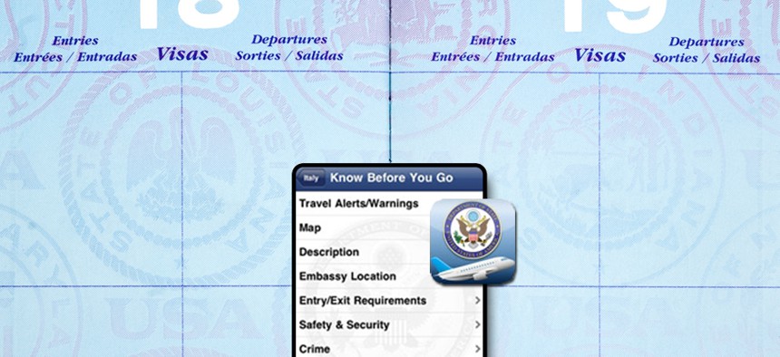
The State Department’s Smart Traveler app has some useful information for foreign travelers, but suffers from so many design flaws it’s unlikely to do them any good, Nextgov’s app reviewers said.
The app includes official country information, travel alerts, travel warnings, maps and U.S. embassy locations. That information is difficult to access, though, and much of it is on external websites that aren’t optimized to work with the app, causing frequent errors.
It made sense that some information, such as travel warnings, had to be pulled in from external websites, said Ted Chan, founder of Practicequiz.com. But the app also linked outside for documents that are rarely updated, such as countries’ visa requirements.
Overall our reviewers gave the app 1.5 stars out of a possible 5.
“It actually just flat out didn't work for me,” Chan said. “The info I needed didn't download and the app was just a blank shell.”
A mobile-optimized website might be a better fit for the information and would suffer from fewer bugs, suggested Yaron Oren, chief operating officer at iSpeech. Because the app requires Internet access for much of its content, a mobile website wouldn’t be more or less convenient for most international travelers.
“With better design this app could be a must have tool for foreign travelers,” said Andrew Borut, co-founder of Eco Hatchery. “Unfortunately its poor design and execution do not match its potential.”


